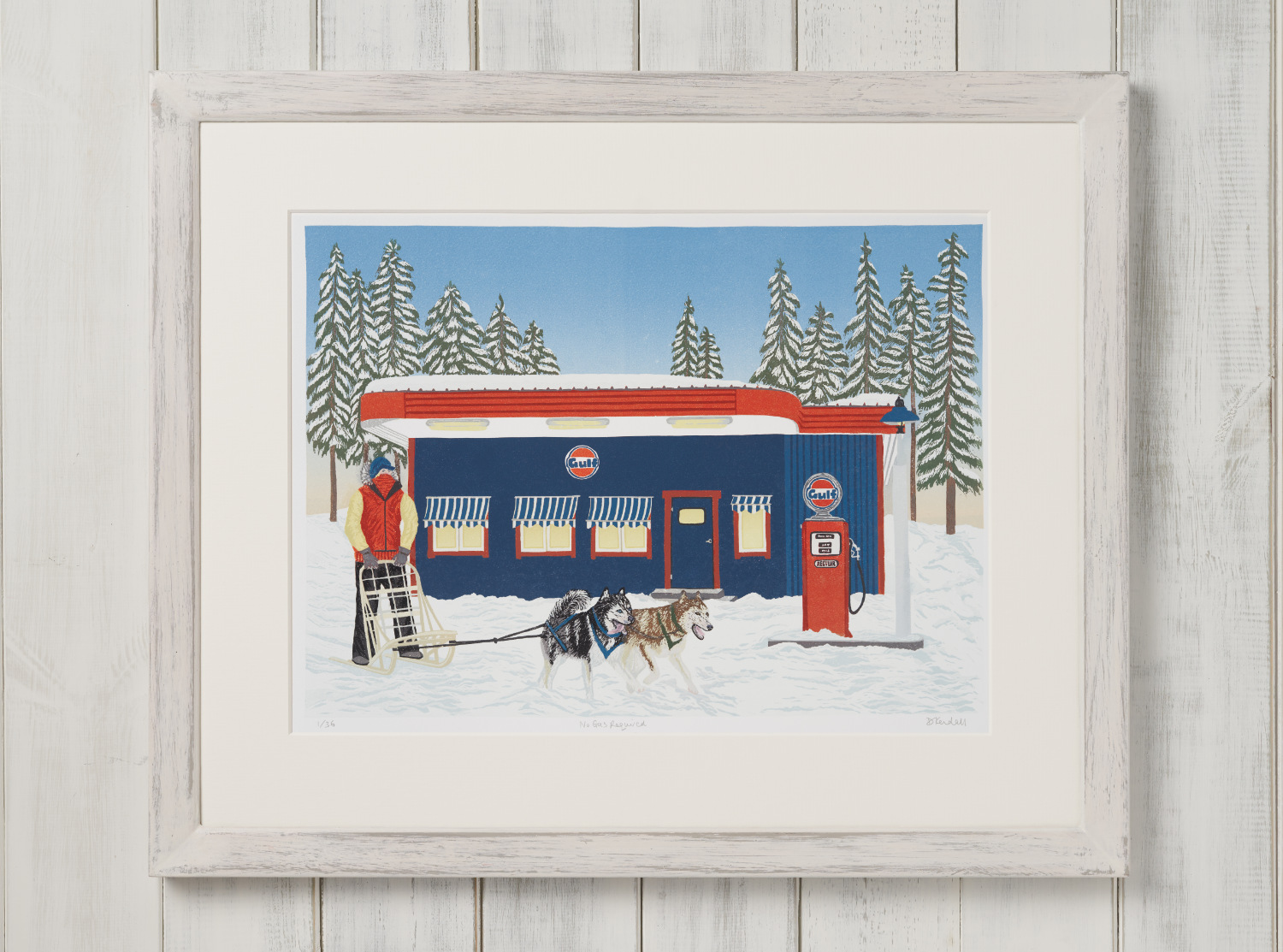
No Gas Required
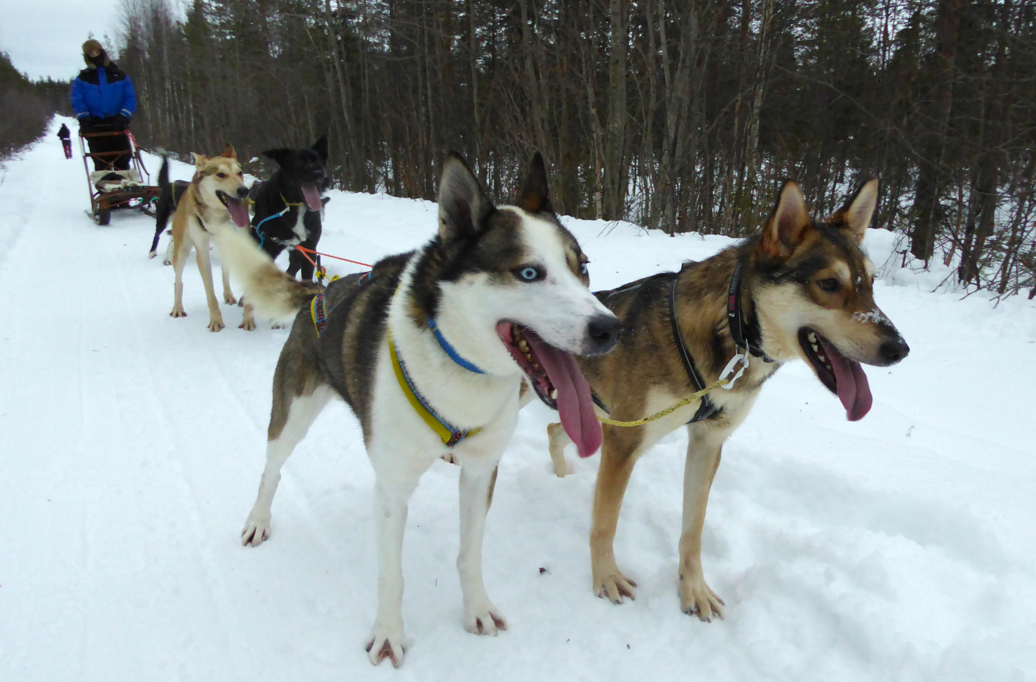
The inspiration for this print came from a trip to the remote village of Tärendö in northern Sweden. One day while husky sledding (mushing) through the snowy back country we passed by a Gulf gas station. I fell in love with this brightly coloured little building.
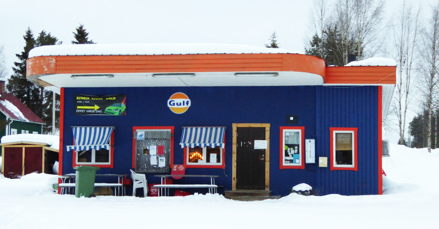
It is painted in the blue and orange signature colours of the Gulf Oil Co. which make a delightfully unexpected contrast to the monochrome landscape. The cheerful blue and white striped blinds at the windows reminded me of the ‘Mom and Pop’ gas stations of America, small family run gas stations and grocery stores at the heart of their rural communities.
The piece de resistance of this little building though is the retro style curved orange roof facade, reminiscent of the architectural style of the original box style gas stations which first appeared in 1930s America. Inspired by the Art Moderne movement they featured flat roofs, rounded corners and streamlined pared back exteriors.
I took a little creative licence when creating my print by adding a vintage style petrol pump out front but the rest is pretty much as I found it.
Driving a husky sled is both incredibly peaceful and enormously exciting. Whooshing across a remote frozen landscape in hypnotic silence punctuated only by the occasional howls of the working dogs is an experience not to be forgotten. As we passed the gas station I felt a curious pride that this timeless way of travelling doesn’t need fuel (at least not of the petroleum variety) and so I named this print “No Gas Required”.
The print is a 28 colour reduction linoprint hand-printed on acid free Zerkall Extra Smooth 150gsm paper. The reduction (or suicide) method of printmaking uses a single linoleum plate to make a multi-coloured print. Through a series of cuttings, inkings and printings, (usually 1 for each colour) the image slowly emerges, colour by colour, as the lino plate is gradually and irreversibly destroyed. A reduction print can therefore never be reprinted.
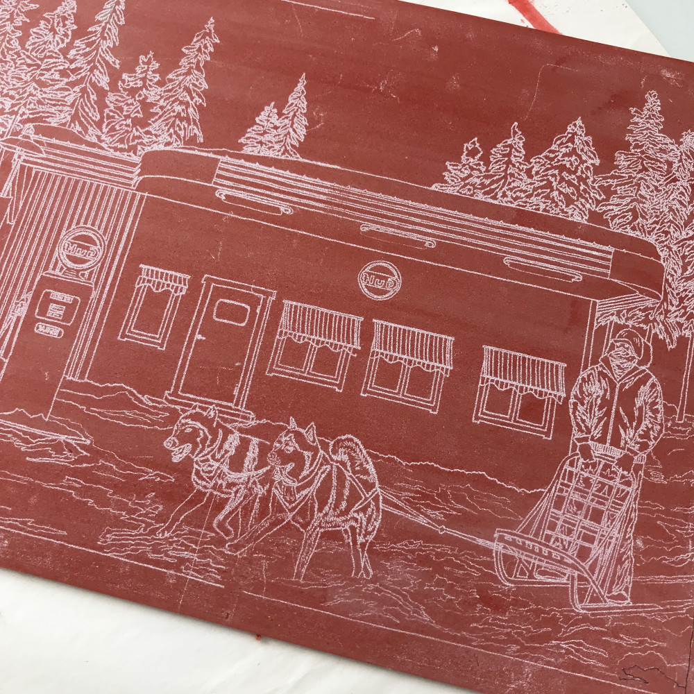
This was my most ambitious print to date in terms of the number of colours used. I like to plan my lino prints in detail in advance, separating the print into layers according to colour. I do this by illustrating each layer digitally on my iPad Pro so I can see how they will work together in the final print. Once I’m happy with this stage I trace the whole design in outline form onto the linoleum ready to start cutting (the lino has been stained red so I can see the tracing more clearly).
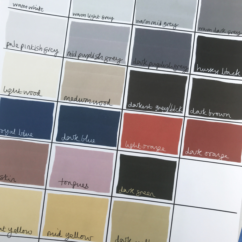
It is often only possible to print one layer (colour) at a time, so in theory with 28 colours, each print would have to go through the press 28 times. It seems incredible, even to me now the print is done, that there are 28 colours in it… but there were 12 shades of white, blue, grey and black so that accounts for a lot! The first few layers I printed were quite subtle and it was exciting to start printing the stronger colours as the print progressed through the layers and see the print come to life.
I use traditional oil based relief printing inks which take up to a week to dry in-between layers so this meant that producing this edition could potentially take up to 28 weeks! Fortunately I was able to print some colours together (when they were in separate areas of the the print) so I managed to print all 28 colours in 14 passes of the press!
Here's a little compilation video of all the different printed layers coming together to make the final print.
I mix all the colours by eye and keep notes of which colours were used as ‘recipe’ sheets that I can use in the future to create similar colours. The recipe is not very precise, for example, I might note that I added ‘speck’ of raw umber or a ‘blob’ of ultramarine!
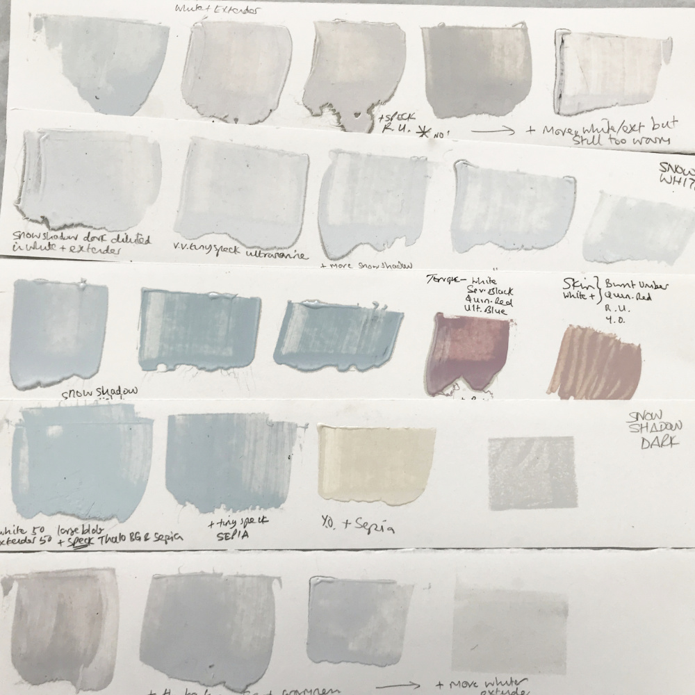
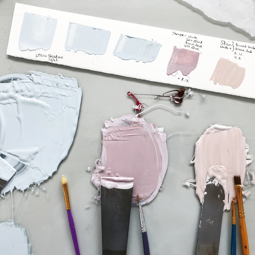
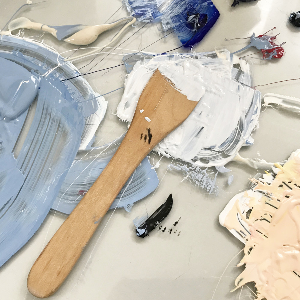
I also used a graded colour effect in the sky and the lighted windows. The sky went from a darker blue at the top, fading to a lighter blue further down the print and to a pale orange at the horizon to suggest the sun rising or setting. This was achieved by mixing and rolling out 3 colours together so they faded into each other, sometimes called a rainbow roll.
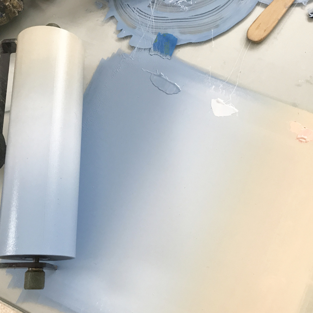
There’s a lot that can go wrong with a reduction linoprint - stray fingerprints, mis registration and poor ink coverage to name but a few. I like to plan such complex prints in minute detail before I start cutting the block. Every time the print goes through the press, the paper must be laid down on the inked lino block in exactly the same position as the previous colour. Even a shift of less than a millimetre in position will result in the layers being mis-registered. Sometimes this mis-registering can look really good and some printmakers use it to great effect but for this print I was aiming for a tightly registered print. I use the Ternes-Burton registration pins and tab system for this.
With a reduction print the linoleum block is slowly cut away and is thereby destroyed as printing progresses. Once each colour has been printed (for example, orange) all the areas of the lino block that were printed orange need to be removed (carved away) so that when the next colour is rolled onto the block and printed it, does not cover up (overprint) the previous colour.
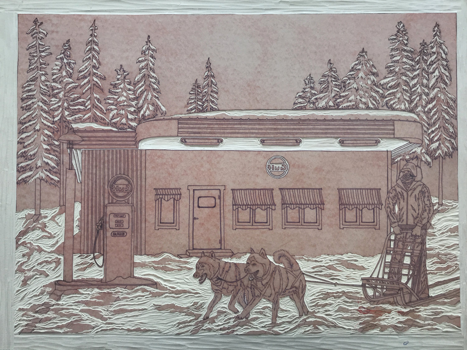
This picture shows the block after printing 2 colours with areas of the snow carved away that have already been printed (the image has to be carved backwards so that it is the right way round when printed!)
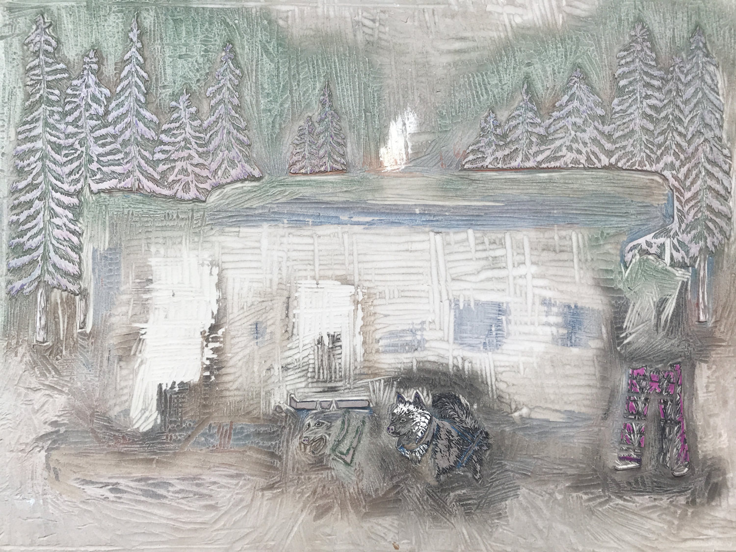
This picture shows what’s left of the block for the final layer of printing. Most of the image has now been carved away and just a few elements remain (trees, the coat and faces of the huskies and the musher’s trousers) for the final inking and printing!
There is always the possibility of an error when when carving away the block. It takes full concentration when carving as the gouges are very sharp and one slip could result in the wrong area of lino being removed or a bloody finger! An error carving the block part way through printing the layers could, in a worst case scenario, mean that the whole edition is ruined, something I prefer not to think too hard about as the print progresses!
For this print the carving all went according to plan and I lost about 15 prints along the way, so the final edition is 36 prints. Now that the lino on the block has been carved almost completely away there is no way that any further prints can be produced.
I love this print, not just because of the memories that it represents for me personally but because of the beauty of the desolate snowy wilderness, the timeless way of life that dog mushing evokes and the architectural quirkiness and retro colours of the gas station (whose services were not required!).
