My Hand Lettering Work
Hand lettering is the art of drawing letters by hand. It is more akin to illustration than calligraphy, although in both cases the letters are drawn by hand.
Hand lettering is completely free in its execution. The layout and letters are often sketched out in alternative forms before the final look is decided upon, much in the same way an artist would experiment when making an artistic drawing, be it a portrait, still life or abstract work of art.
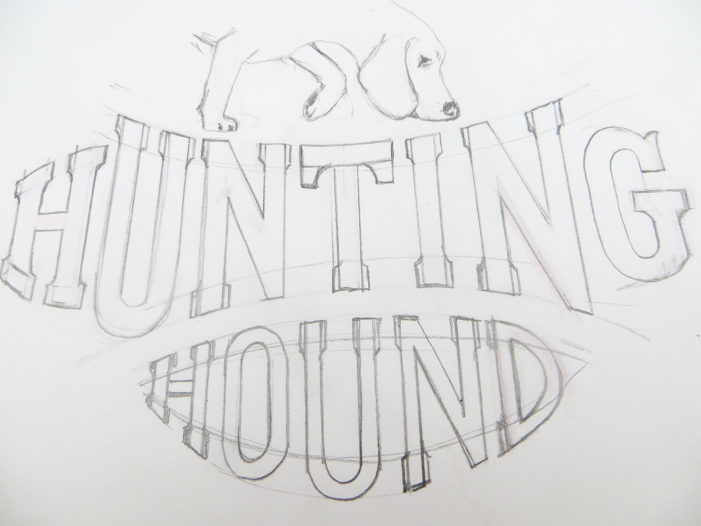
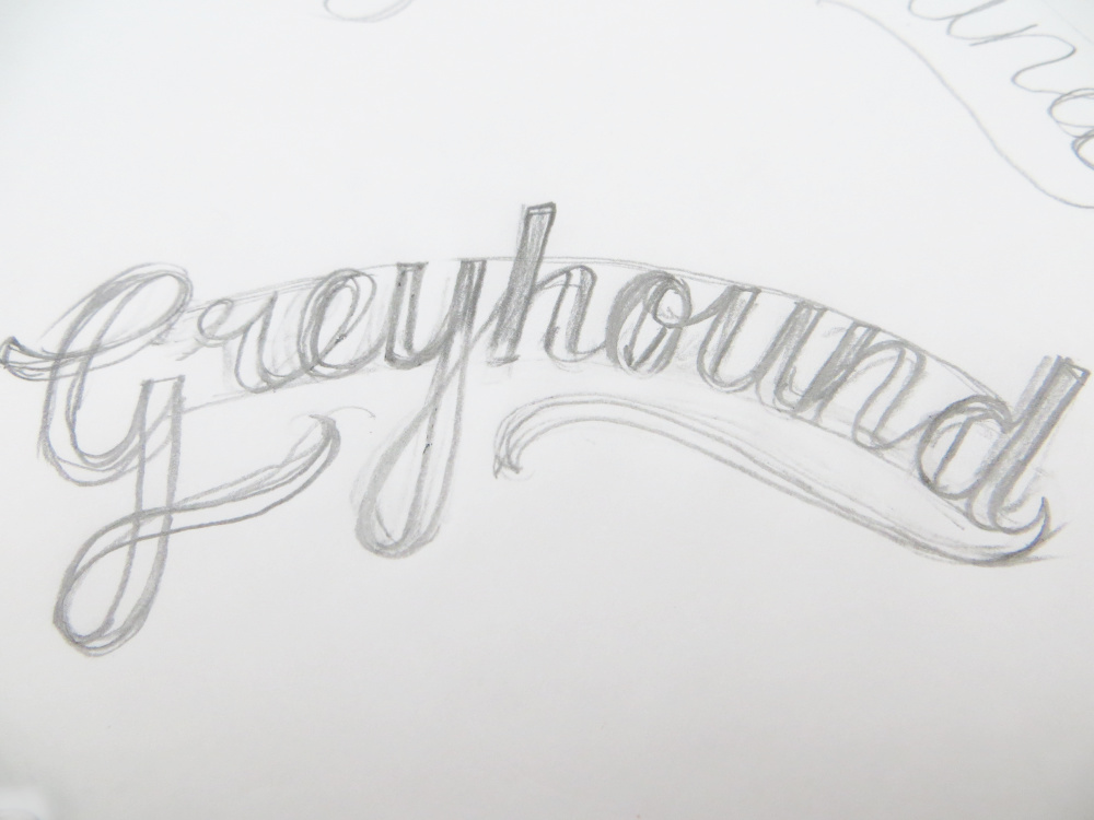
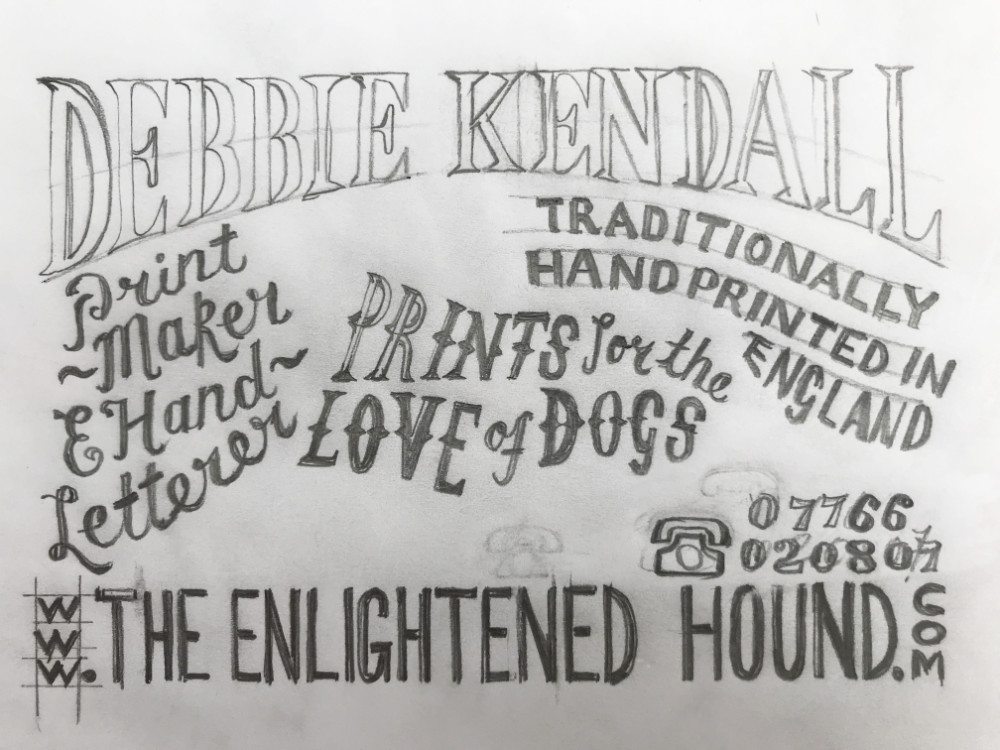
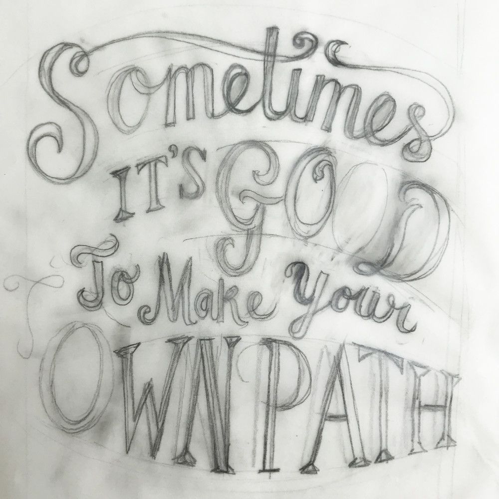
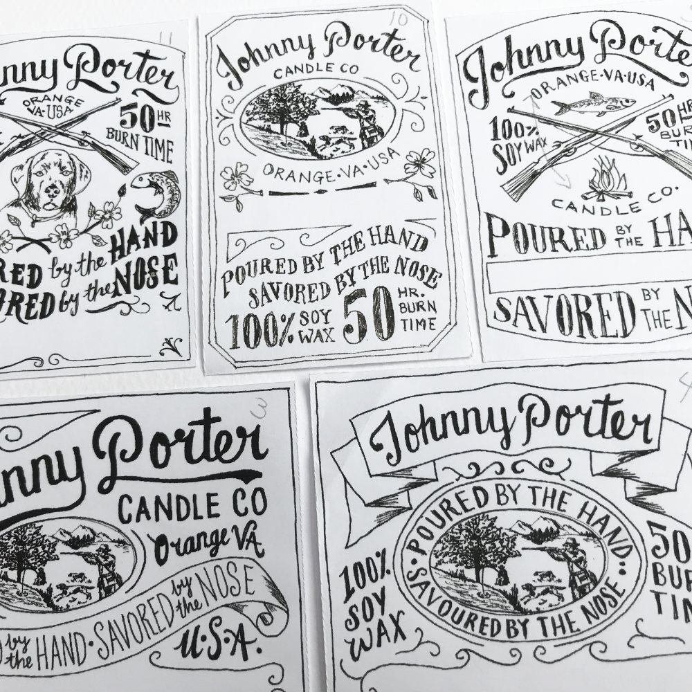
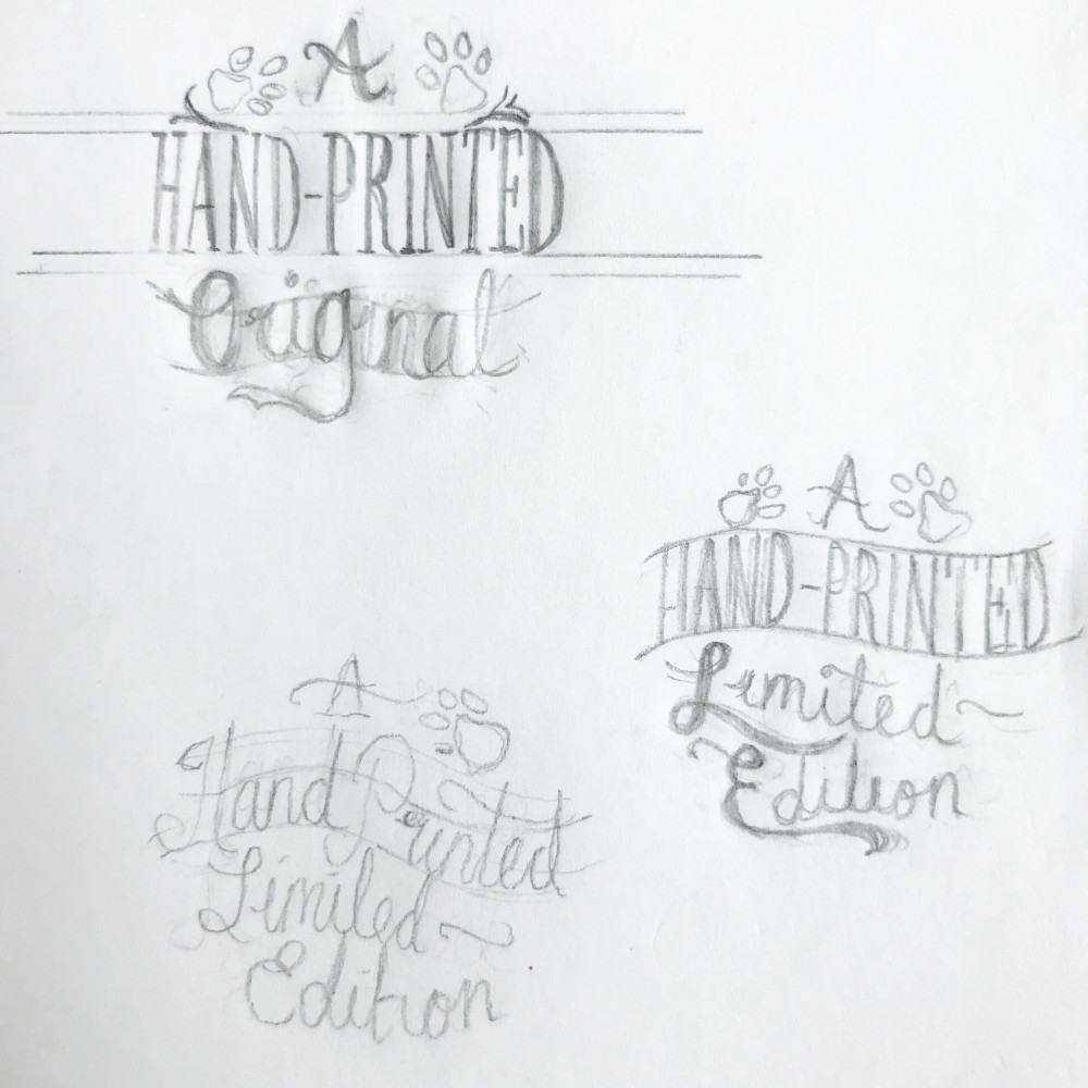
There are no rules that govern the shape or size of the letters, beyond the imagination of the lettering artist, although spacing, readability and balance must be considered if the lettering is to fulfil its function.
With hand drawn letters, no two letters will be identical as they are all individually drawn. Of course, you could use your hand drawn letters to create a repeatable typeface (and there are many examples of these hand drawn fonts available) but as soon as they are used in a repeatable way (i.e. each letter “a” will be identical etc.) they no longer fall under the category of hand lettering.
There are no specific tools for hand drawing letters... a pencil, pen, paint, a muddy stick! Pretty much anything goes as long as it makes a mark on the paper!
Hand drawn letters are often used to create words to fit into a dedicated space within a layout, with the letters becoming an integral part of the overall design. It is often the case with hand lettered work, that when the letters are removed from the complete artwork, they will rarely ‘fit’ anywhere else because they have been designed to work best in that specific place, and to complement other decorative elements that are part of the finished piece.
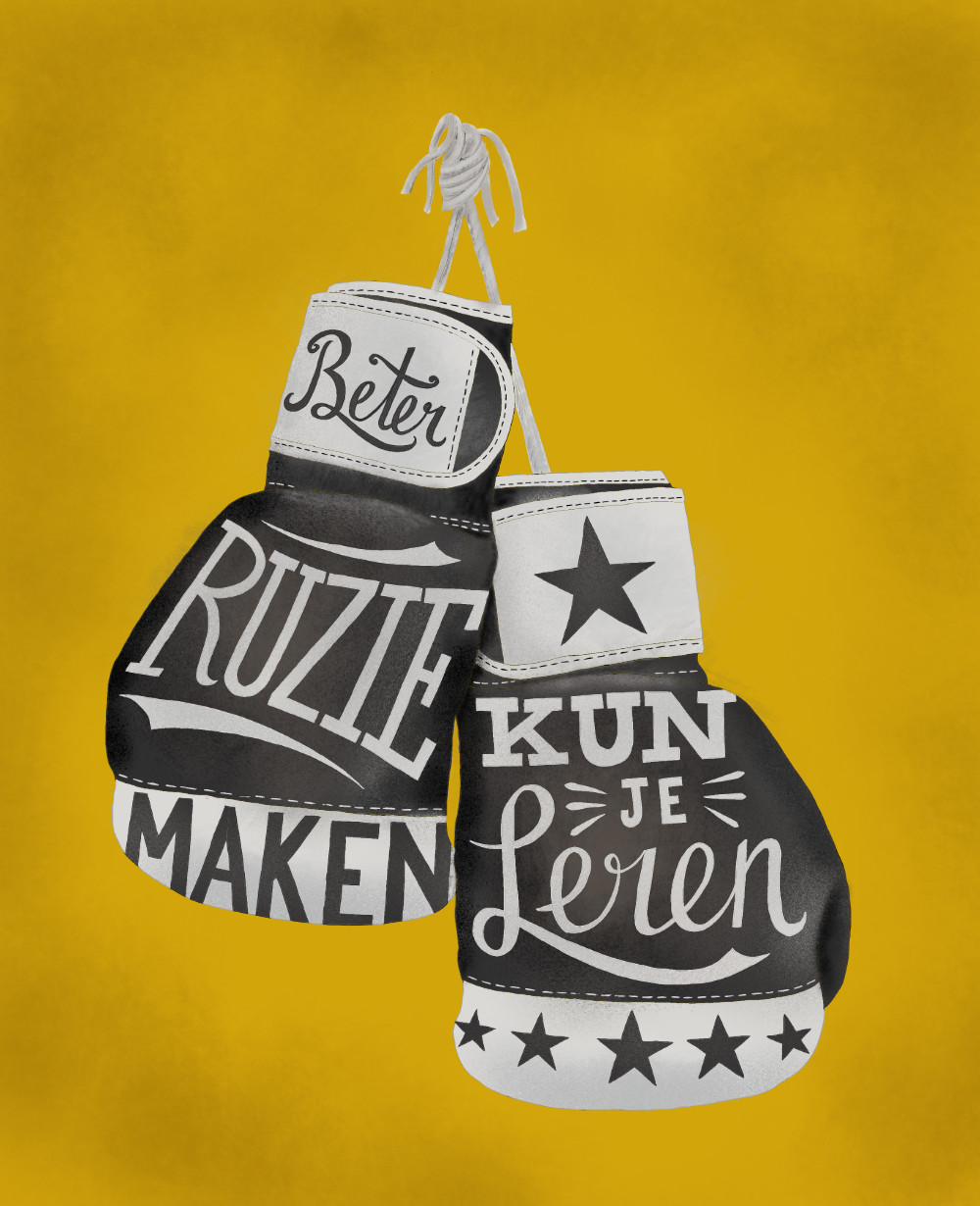
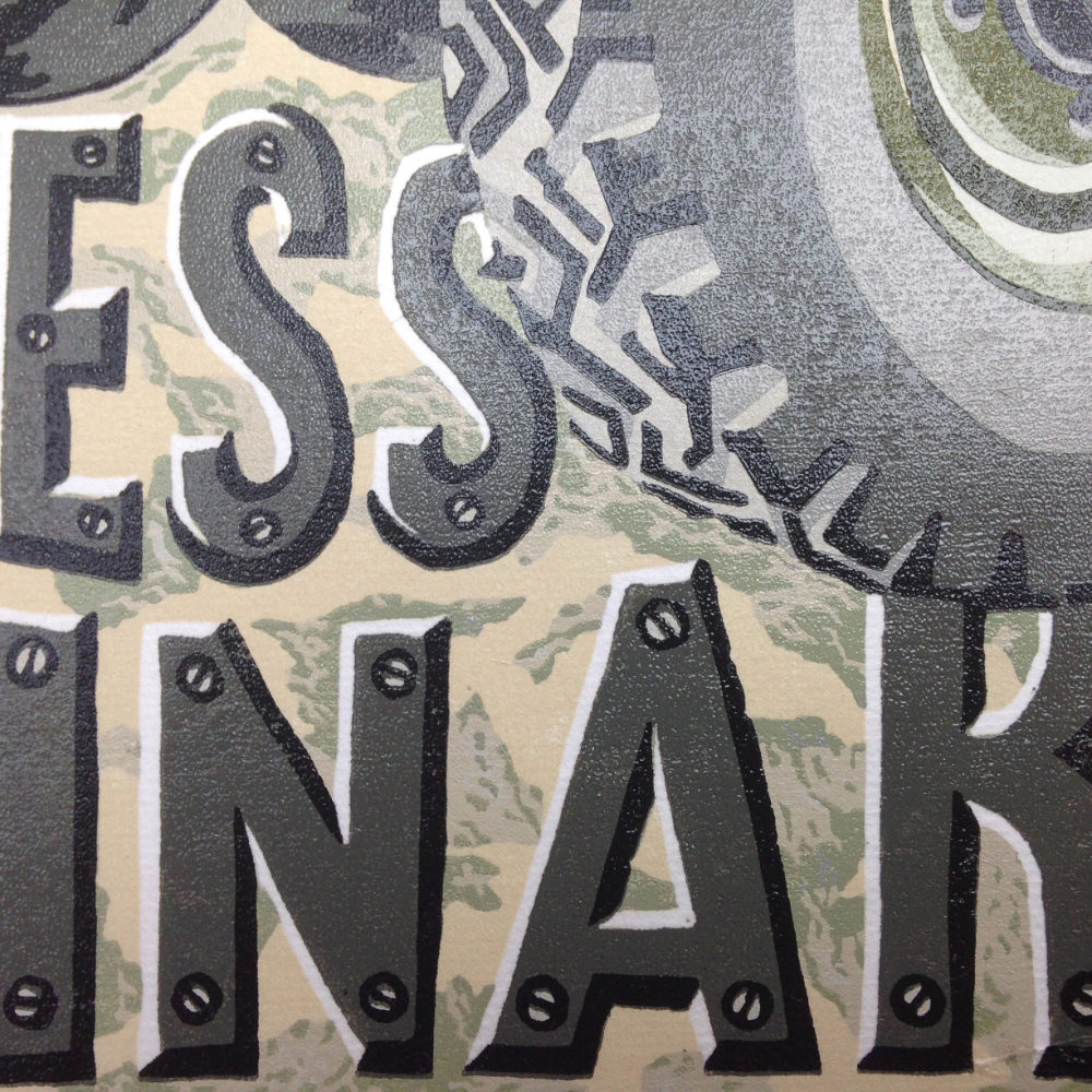
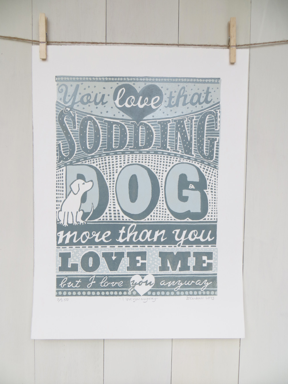
A selection of my hand drawn lettering work


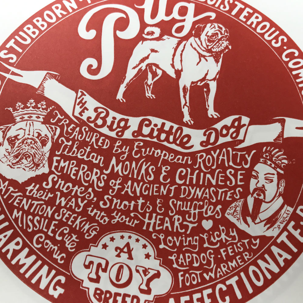
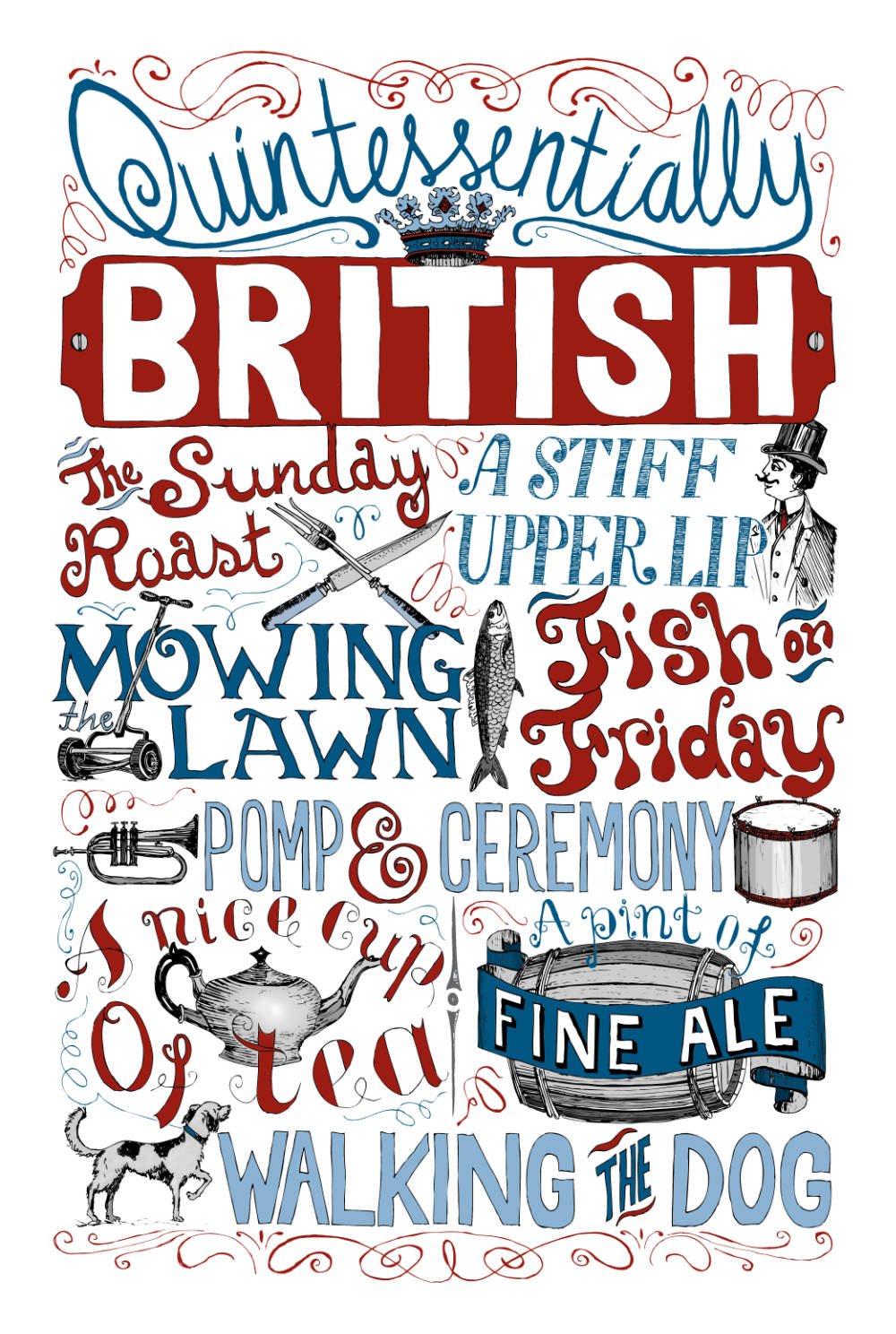
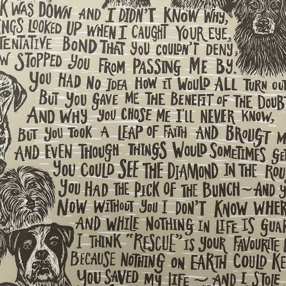

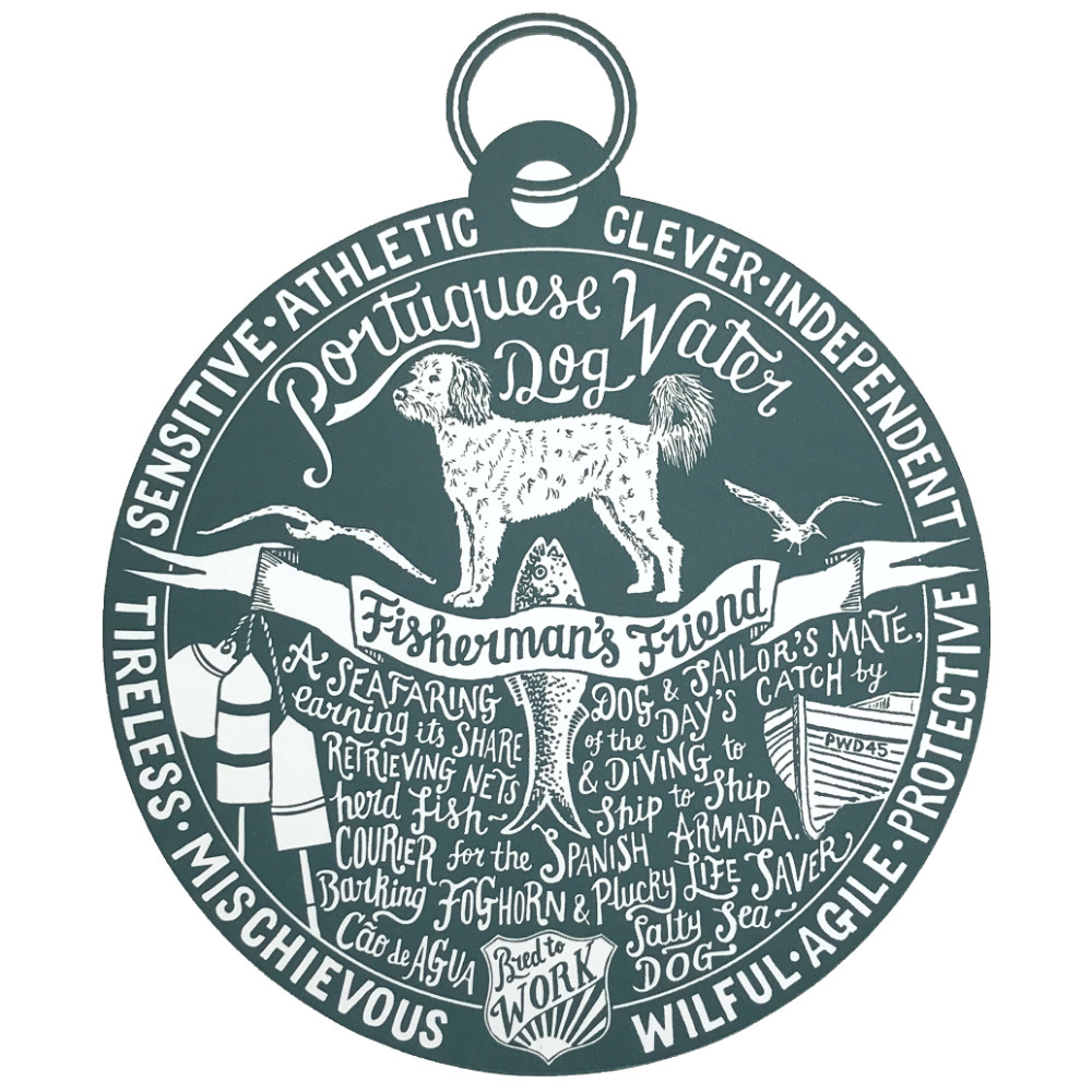
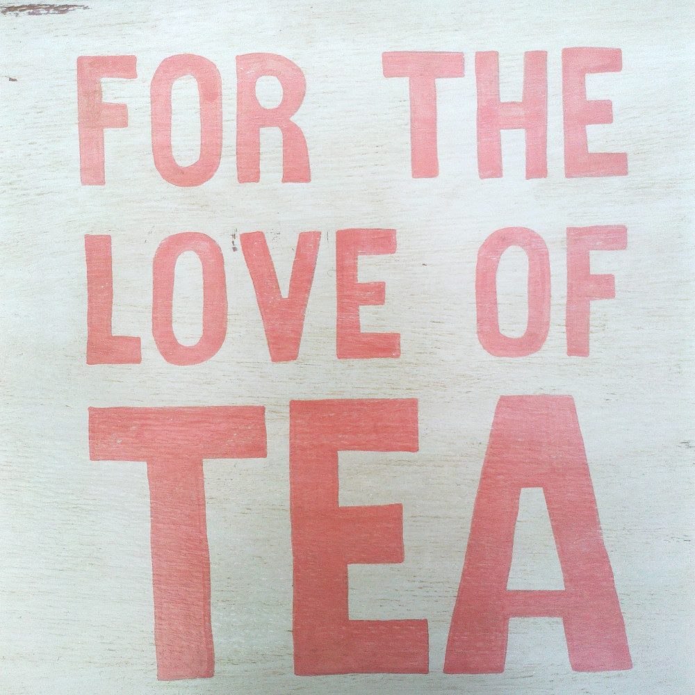
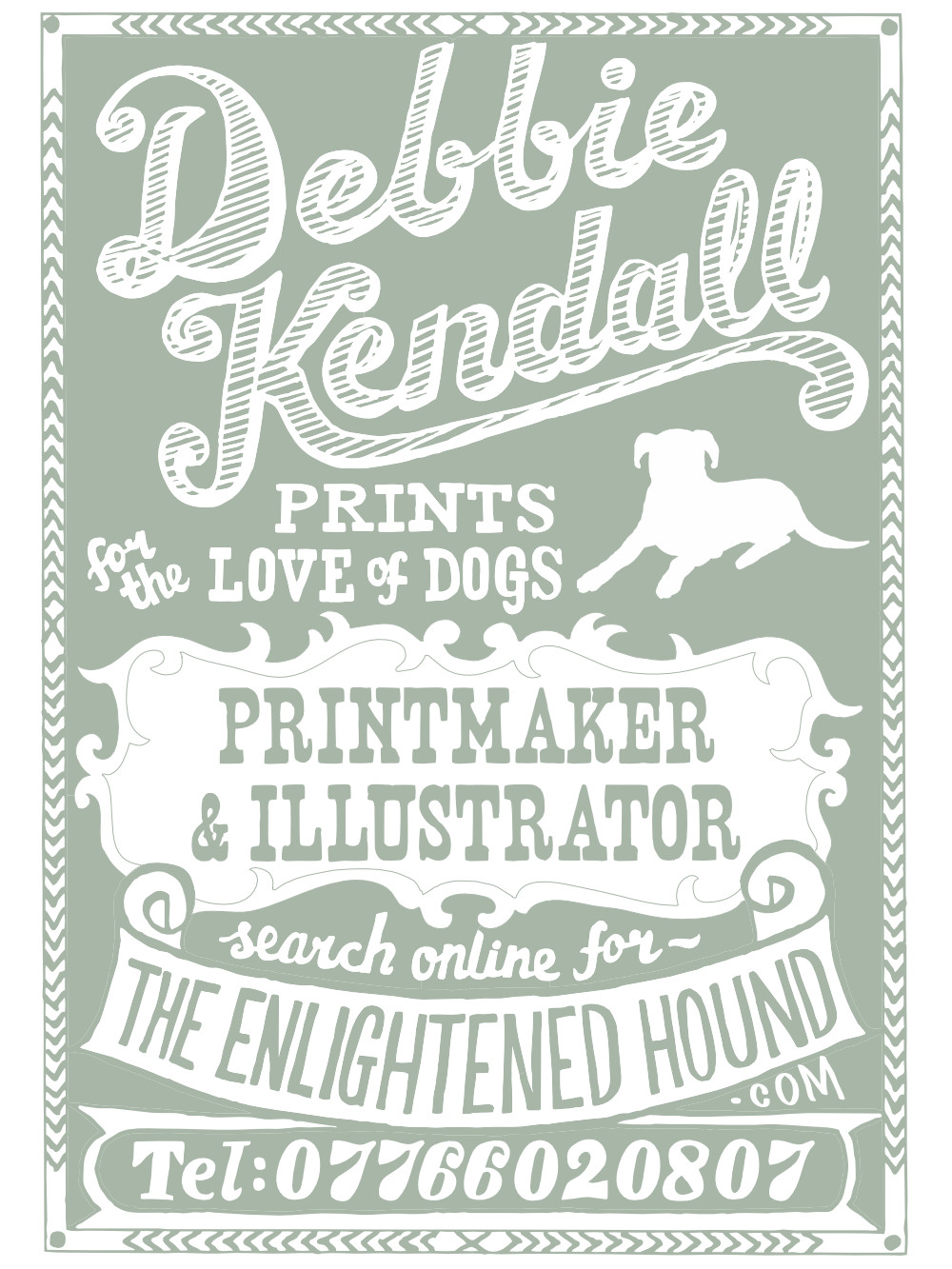
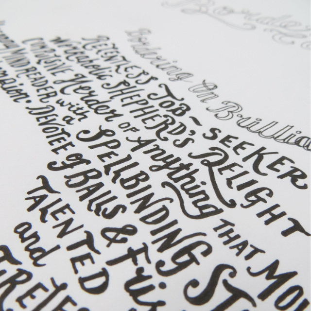
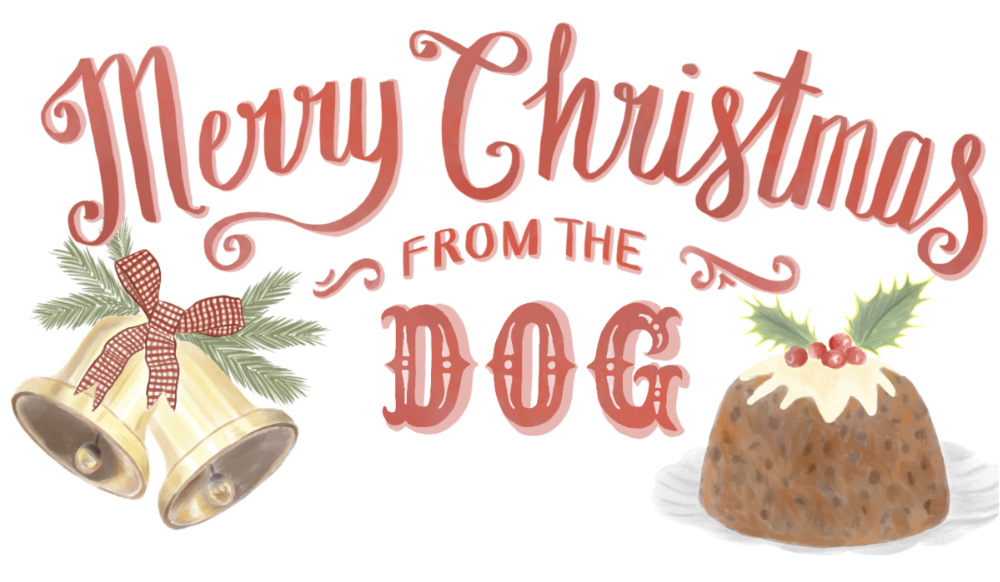
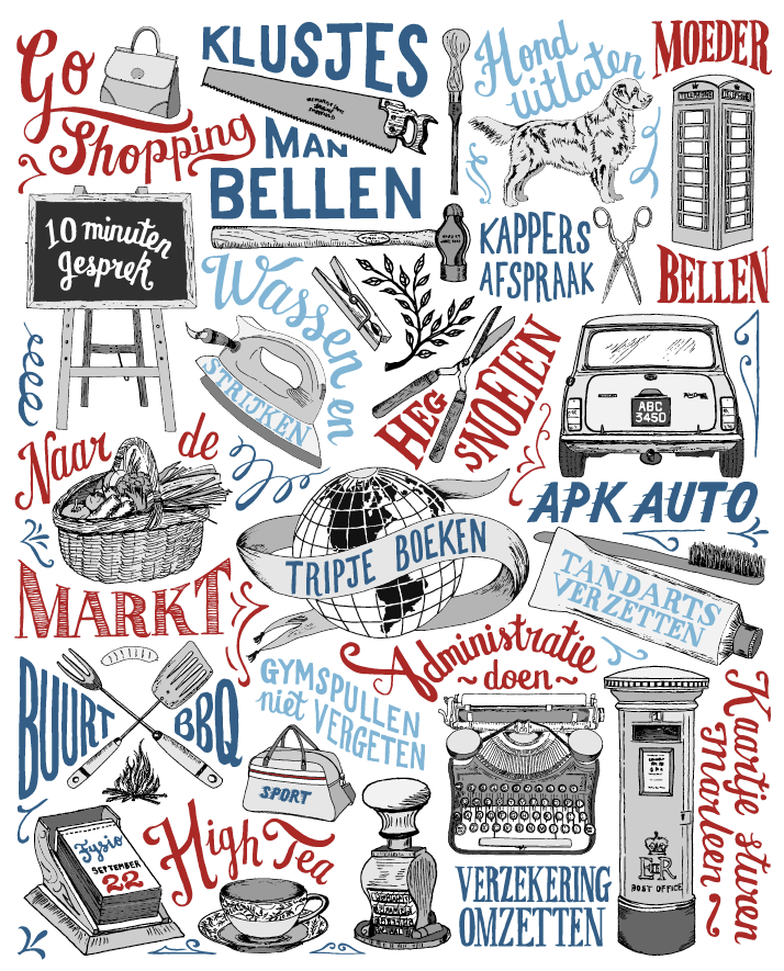
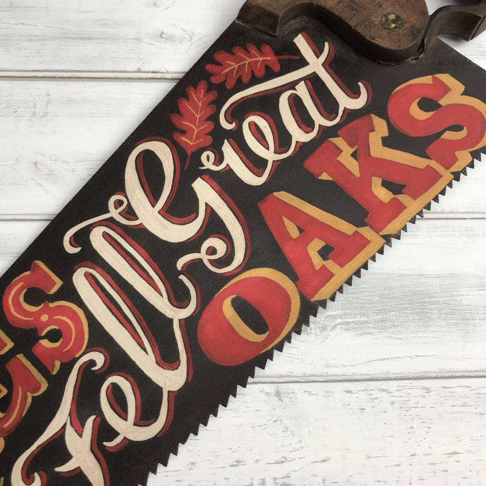
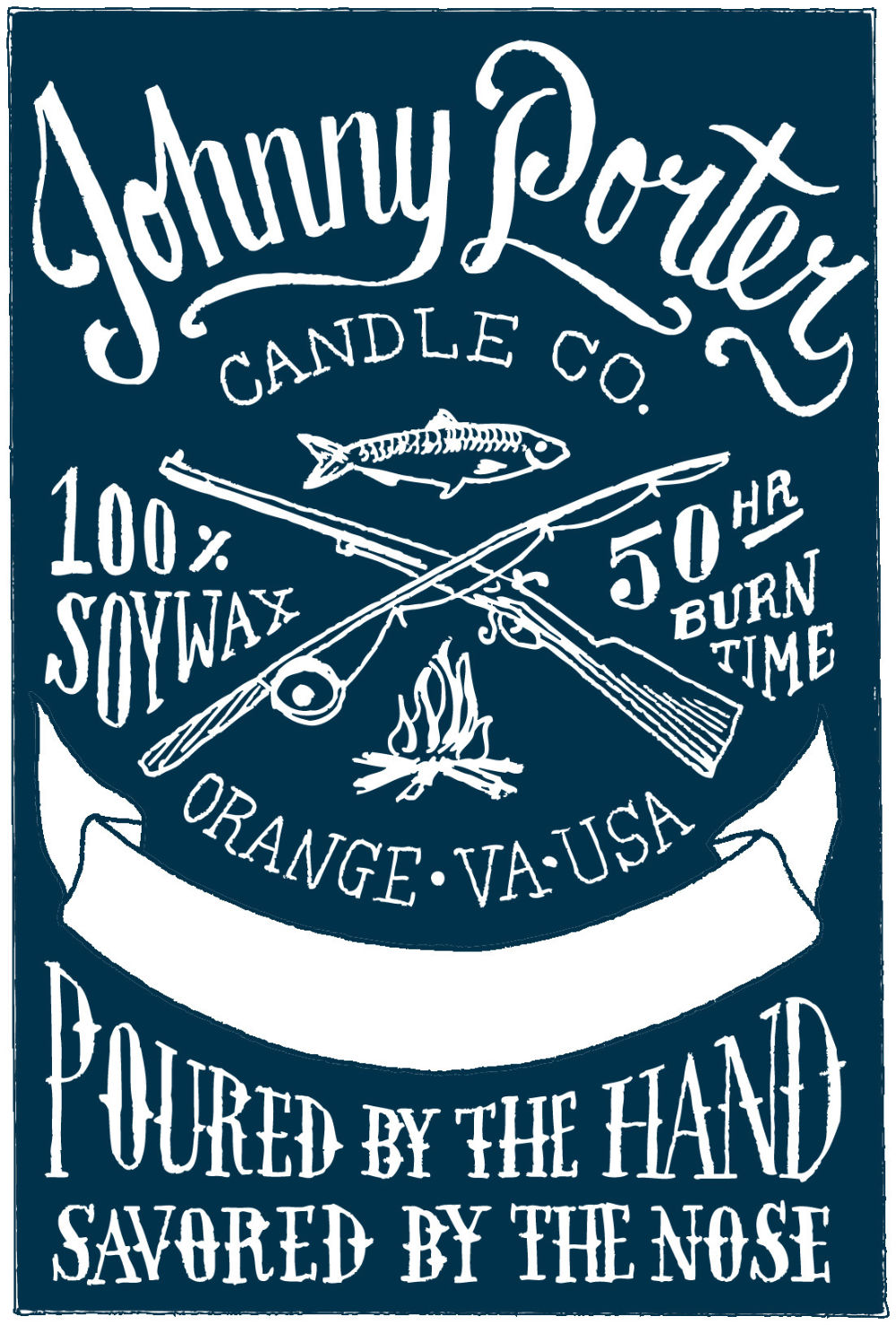
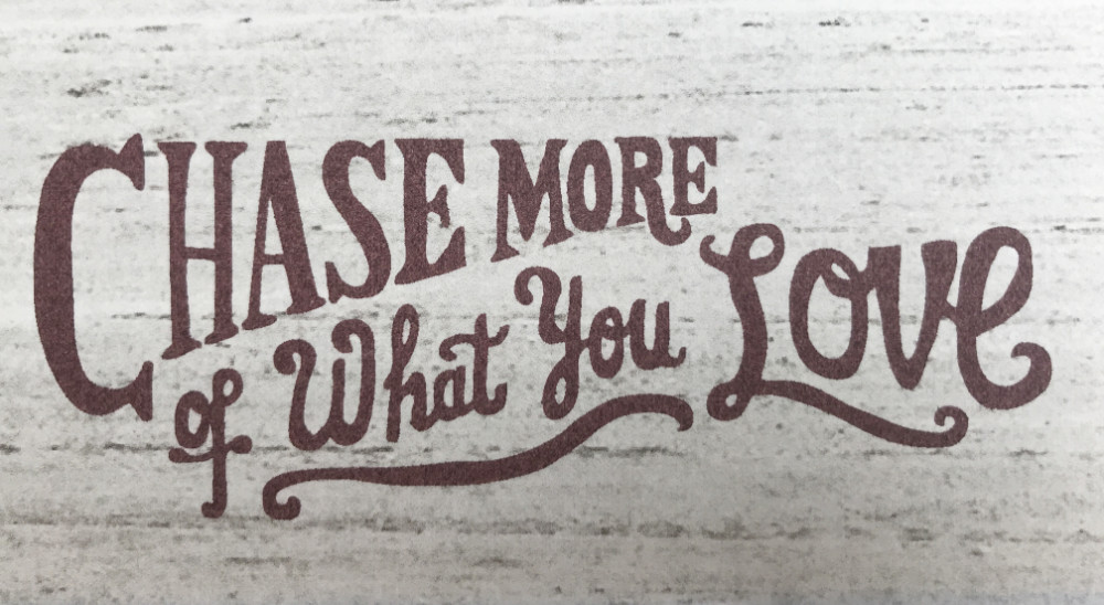
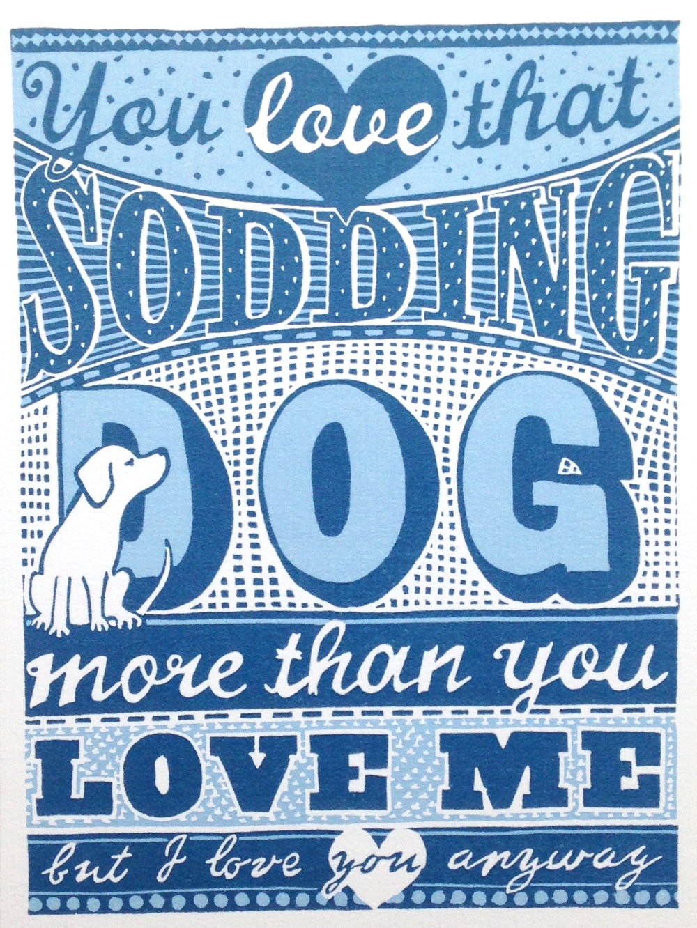
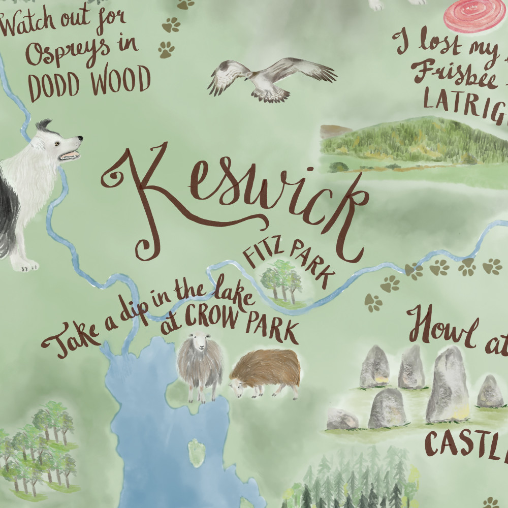
For the sake of completeness and in case you are wondering, there are some other words that are often used interchangeably when talking about lettering... some examples of these are calligraphy, typography, typeface and font.
Calligraphy is the ancient art of beautiful writing and calligraphers use special tools (brush pens and dip pens) to write each letter. They create beautiful writing by using precise strokes of the pen and following rules that determine how the letters will look. Historically these rules were pretty inflexible so each script e.g. gothic script, would look very similar whoever had written them, though many of today's modern calligraphers have developed a freer style of writing that reflects their own personal style. However letters are still written in a fluid motion, using specific pressure and strokes with traditional nibs or brushes, without sketching the letters out first.
A typeface is a particular design of lettering e.g. Times Roman is a typeface, Helvetica is another typeface. However there are many variations within a typeface, for example it maybe bold or italic and come in different sizes, e.g. 12 point or 14 point.
In days gone by, each size and weight of a typeface had its own set of physical metal letters that were arranged (or set) into words and sentences ready to be inked and printed. These sets of letters were called fonts and strictly speaking a font is the actual physical variant of the typeface that you are using.
Nowadays as most typefaces are computerised there are no physical fonts to arrange but the word font is still used to refer to the subset of the typeface that is being used.
Typography is the art of arranging type in a legible and appealing way. It is related to the skill of “setting type” in the days when printed matter was created by literally laying out each letter, initially by hand but later in a mechanised process, ready for printing. It uses a repeatable system of letters, which are identical each time they are used. For example, in this blog post, each letter “e” is the exactly the same wherever it appears on the page.
Although you may see reference to the term “hand lettered typography” this is actually incorrect because the term typography relates to the use of type which has repeatable identical letters - characteristics that hand drawn letters do not have!
Example: A typographic print vs a hand-lettered print
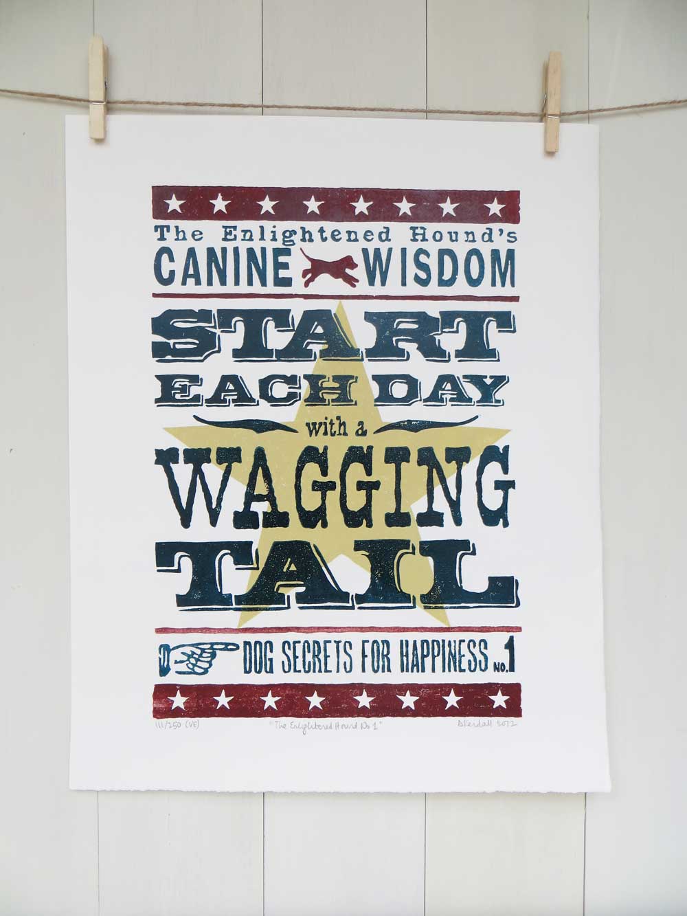
It might seem at first glance that the two prints above are examples of hand lettered work however the one on the left was created using a historical font and the one on the right was created with hand drawn letters. The give away is to look at the repeating letters to see if they are identical, for example the three letter "G"s in "Wagging" are exactly the same however in the print on the right, no two letters are identical becasue they have all been individually drawn.
Therefore only the print on the left can be accurately described as a typographical print because it was created by laying out a font.


