My Logo Design & Branding
My main logo
When choosing a name for their brand, it's always a dilemma for an artist or designer whether to use his or her name as the brand or to create a business name and build the brand around that name instead.
Most artists are known and recognized by their names and it is generally considered best for an artist to use their given name as their brand because as an artist, you are your brand, and using your own name gives an immediate and personal connection.
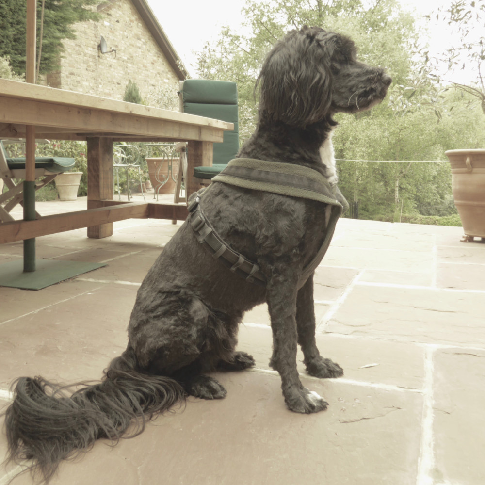
Not one for following the rules and inspired by my Portuguese Water Dog, Figo, I named my fledgling creative start-up "The Enlightened Hound" because I wanted to celebrate the many ways that dogs teach us humans about love, life and happiness.
Loyal, curious, brave, determined, devoted and forgiving, dogs seem to instinctively know how to live in the moment, guided by unadulterated joy and unconditional love. My first set of linoprints, the Canine Wisdom series, were a handcrafted reminder of the joy of following "the way of the dog".
As hand lettering is a big part of my work, it was important to me that my logo and other visual branding elements were hand drawn which both reflects my love of hand drawn letters and enhances the hand-made nature of my prints.
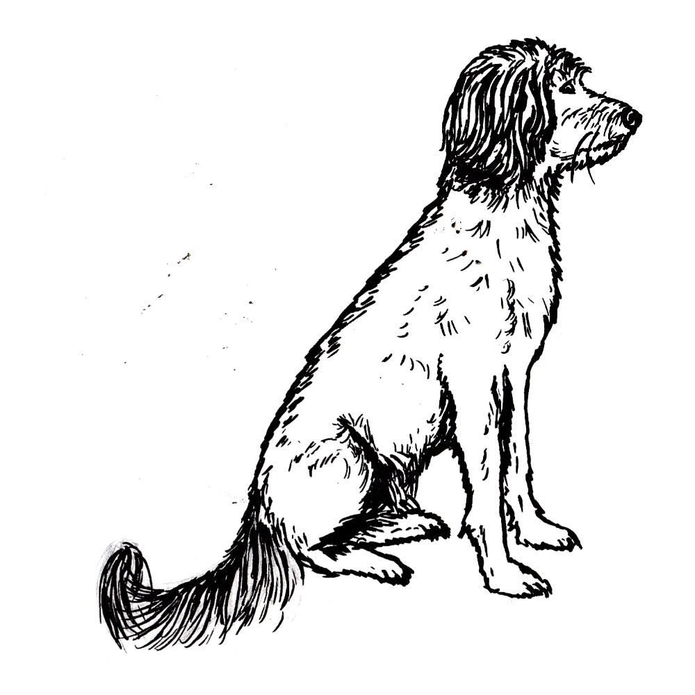
As my dog Figo was the inspiration behind by my art, it seemed only fitting that he would feature on the main logo! The hand drawn letters were based on historic fonts from the mid 19th century. I chose a sans serif display font for "The Enlightened Hound" and a classic slab serif 'vintage typewriter' style font for the strapline.

Logo development and tradecards
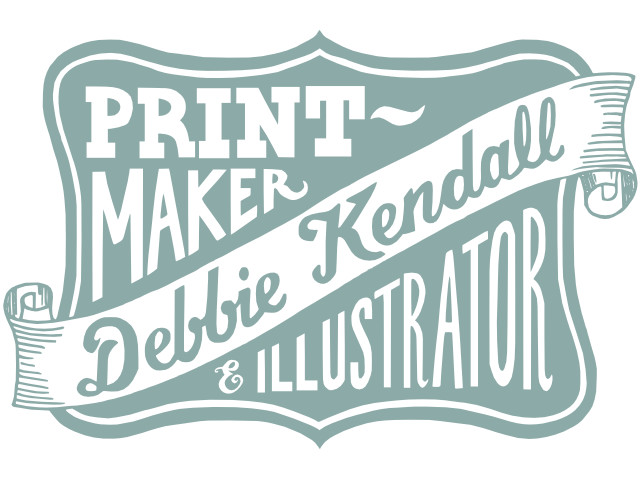
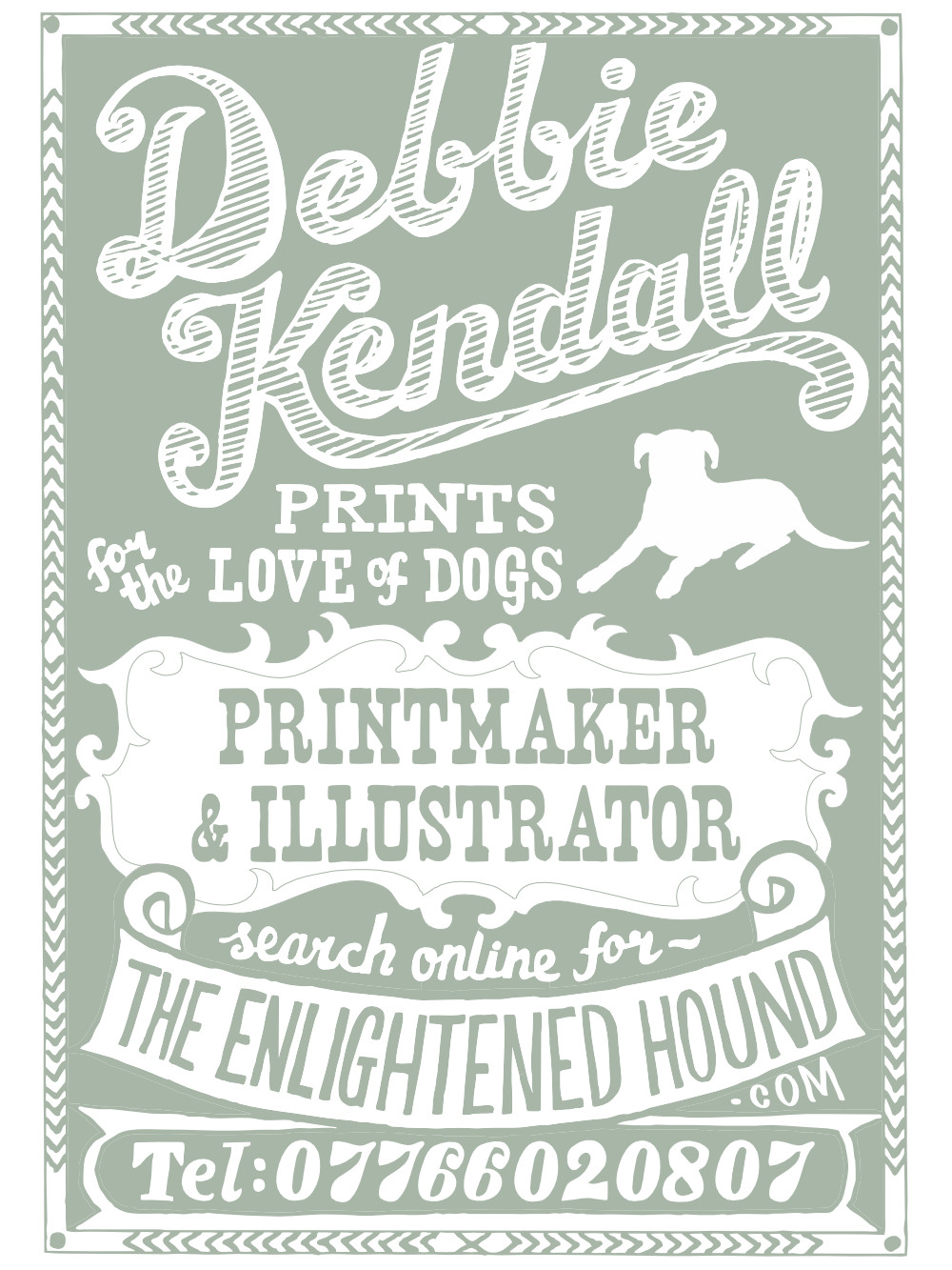
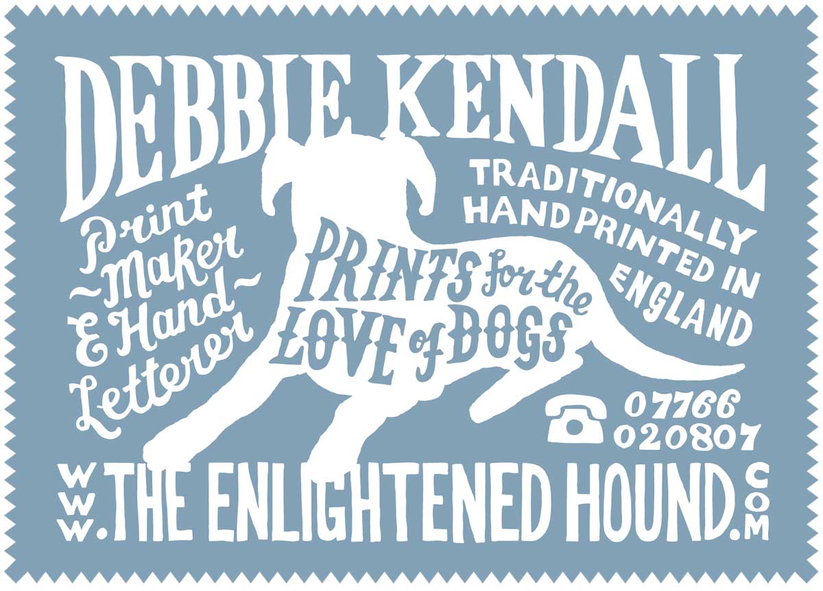
After a while I decided that I did want to give my own name some more prominence in my brand. I wanted a logo that featured my name that I could use alongside my brand and some business cards that I would enclose with customer orders.
I've always been inspired by the typographers, artists and 'jobbing' printers of the 19th century whose job it was to create eye-catching designs for leaflets, posters, tradecards, advertisments, product packaging and a plethora of other printed ephemera, ranging from bus tickets to theatre programmes. These were the early graphic designers before their craft was even given a name. I love the bold graphic fonts and ornamental lettering of old wooden type combined with decorative flourishes and banners that are typical of 19th century adverts and product packaging. American show posters, matchbox labels and decorative product tins, especially for medicinal products, are particular favourites of mine!
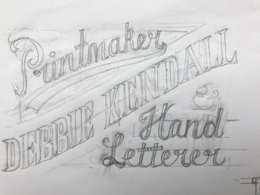
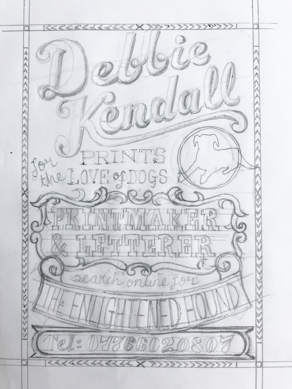
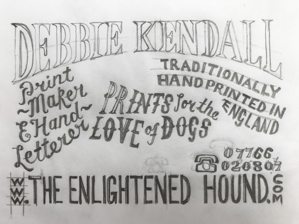
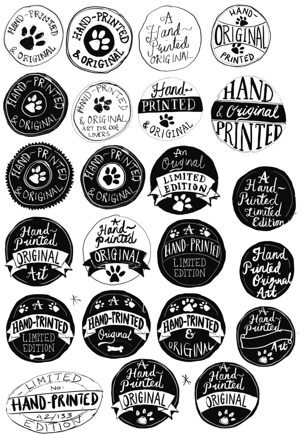
As is usual with any hand lettered piece, the designs started out as thumbnail sketches which were then worked up into alternative designs. The winning concepts are then inked and scanned into my Mac to create vector artwork for print or web use.
Website buttons
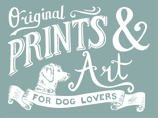
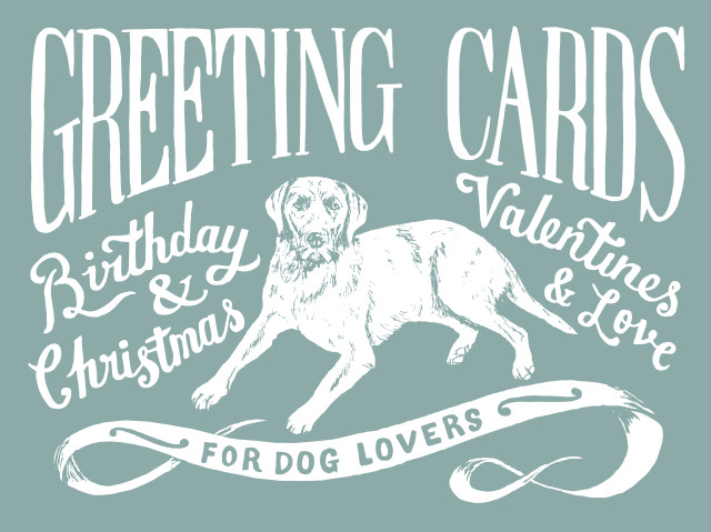
When designing my website I also wanted to create some hand lettered elements that were designed to help reinforce the artistc and hand-made values of my work. They work as clickable pictorial buttons instead of the usual 'text in a box' type buttons.


Branded packaging
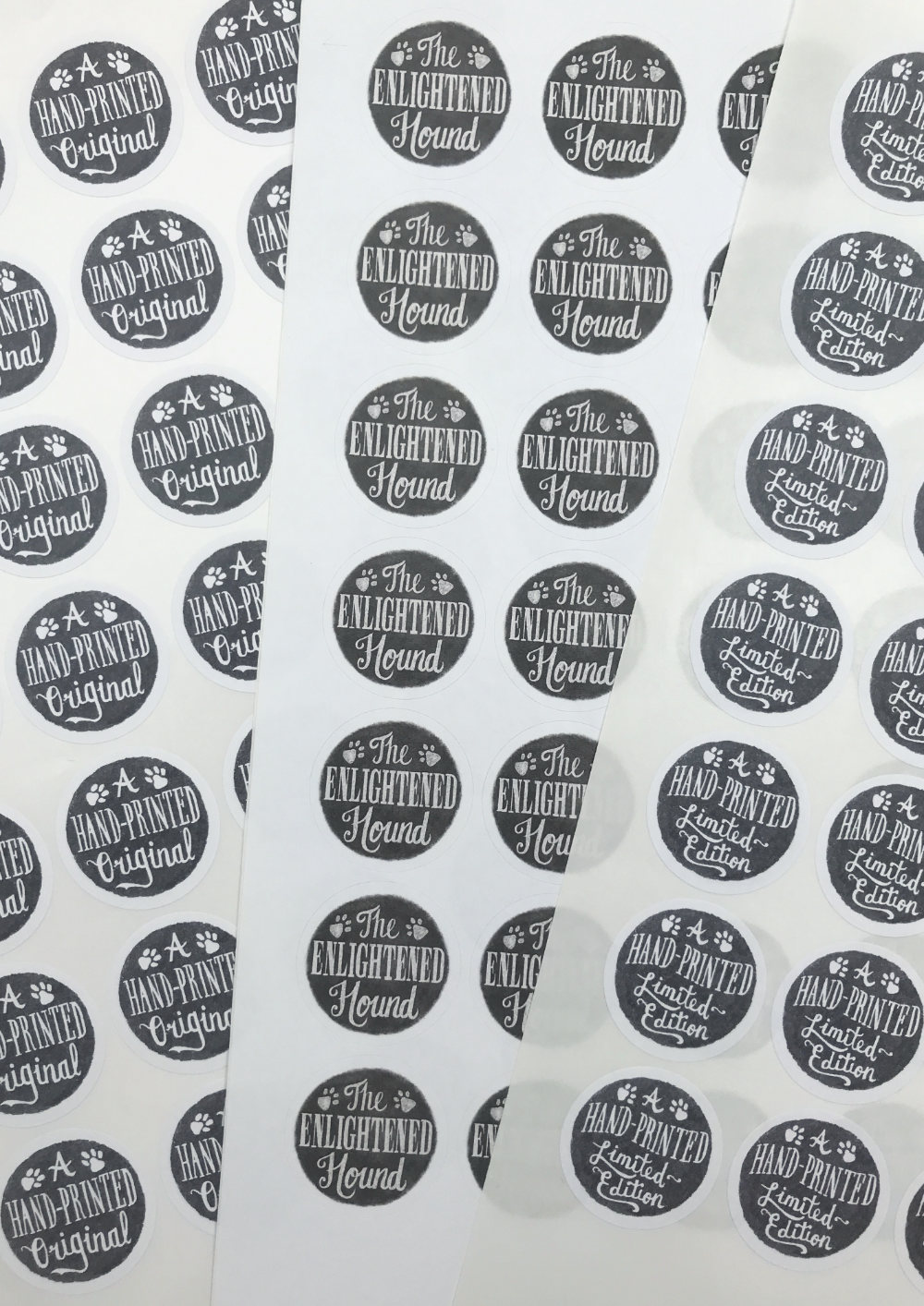
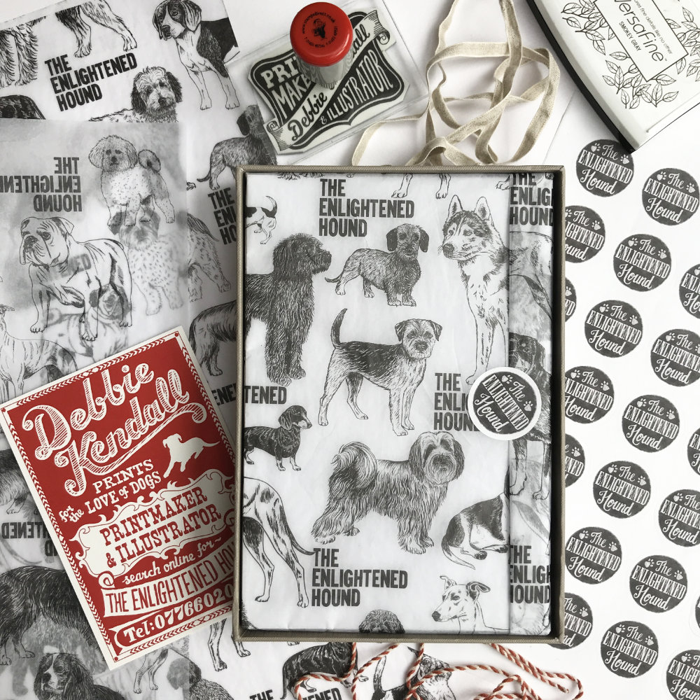
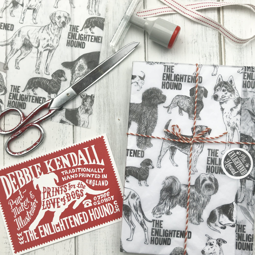
I love receiving a beautifully packaged parcel so I wanted to create some stickers and branded doggie tissue paper to wrap my prints when people choose my work.
